#Support for simple features, a standardised way to encode spatial vector data
library(sf)
#Data manipulation
library(dplyr)
# An R package for network manipulation and analysis
library(igraph)
# Provides a number of useful functions for working with character strings in R
library(stringr)
# for data visualization
library(ggplot2)
# for graph visualization
library(ggraph)
# for tidy data handling with graphs
library(tidygraph)
# for geospatial visualization
library(ggspatial)5 Network Analysis
Network Analysis is an interdisciplinary analytical framework which studies the structure, behavior, and dynamics of the connections between different elements. Specific applications range from the analysis of social links between people to the analysis of transportation and migration links between places.
In particular, network analysis has proven to be highly effective for gaining insights about the behavior of populations, and the spatial distribution of people and resources (Prieto Curiel, Cabrera-Arnau, and Bishop 2022). By examining the networks of human interactions, researchers can gain a better understanding of how social, economic, and cultural factors influence individual behavior, and how patterns of migration and communication can shape the development of communities, regions and cities (Cabrera-Arnau et al. 2022). By the end of this session, you should be able to describe some of the most fundamental concepts and tools for network analysis. You should also be able to understand the potential of this approach to revolutionise the way in which we study populations.
The chapter is based on the following references:
Network analysis with R and igraph: NetSci X Tutorial (Ognyanova 2016).
igraph - The network analysis package.
The book Networks by Newman (2018) is an excellent resource to learn more about network analysis, which covers the basics but also the more advanced concepts and methods.
5.1 Dependencies
To run the code in the rest of this workbook, we will need to load the following R packages:
5.2 Data
5.2.1 Internal migration in the UK estimated from Twitter data
In this Chapter we will be looking at data derived from Twitter, now known as X. In particular, we will use the file internal_migration_uk.csv, which contains migration data between UK local authorities in two consecutive months. The dataset was originally created to analyse internal migration movements before and during COVID-19. For more details on the methodology and the results of the analysis, you can check the paper (Wang et al. 2022).
5.2.2 Import the data
Before importing the data, ensure to set the path to the directory where you stored it. Please modify the following line of code as needed.
df <- read.csv("./data/networks/internal_migration_uk.csv")In this practical, we will only analyse population movements between April 2019 and May 2019, so we can filter the dataset accordingly.
df <- df %>% filter(month_start=='2019-04') Each row corresponds to an origin-destination pair, so we can obtain the total number of reported migratory movements with the following command:
nrow(df)[1] 42715.3 Creating networks
Before we start to analyse the data introduced in Section 5.2, let us first take a step back to consider the main object of study of this Chapter: the so-called networks. In the most general sense, a network (also known as a graph) is a structure formed by a set of objects which may have some connections between them. The objects are represented by nodes (a.k.a. vertices) and the connections between these objects are represented by edges (a.k.a. links). Networks are used as a tool to conceptualise many real-life contexts, such as the friendships between the members of a year group at school, the direct airline connections between cities in a continent or the presence of hyperlinks between a set of websites. In this session, we will use networks to model the migratory flows between locations.
5.3.1 Starting from the basics
In order to create, manipulate and analyse networks in R, we will use the igraph package, which we imported in Section 5.2. We start by creating a very simple network with the code below. The network contains five nodes and five edges and it is undirected, so the edges do not have orientations. The nodes and edges could represent, respectively, a set of cities and the presence of migration flows between these cities in two consecutive years.
# Create an undirected network with 5 nodes and 5 edges
# The number of nodes is given by argument n
# In this case, the node labels or IDs are represented by numbers 1 to 5
# The edges are specified as a list of pairs of nodes
g1 <- graph( edges=c(1,2, 1,4, 2,3, 2,4, 4,5), n=5, directed=F )
Warning: `graph()` was deprecated in igraph 2.1.0.
ℹ Please use `make_graph()` instead.# A simple plot of the network allows us to visualise it
plot(g1) 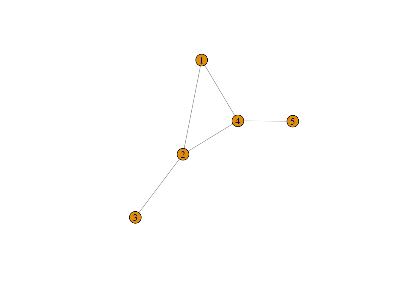
If the connections between the nodes of a network are non-reciprocal, the network is called directed. For example, this could correspond to a situation where there are people moving from city 1 to city 2, but nobody moving from city 2 to city 1. Note that in the code below we have not only added directions to the edges, but we have also added a few additional parameters to the plot function in order to customise the diagram.
# Creates a directed network with 7 nodes and 6 edges
# Note that we now have edge 1,4 and edge 4,1 and that 2 of the nodes are isolated
g2 <- graph( edges=c(1,2, 1,4, 2,3, 4,1, 4,2, 4,5), n=7, directed=T )

# A simple plot of the network with a few extra features
plot(g2, vertex.frame.color="red",  vertex.label.color="black",
vertex.label.cex=0.9, vertex.label.dist=2.3, edge.curved=0.3, edge.arrow.size=.5, edge.color = "blue", vertex.color="yellow", vertex.size=15) 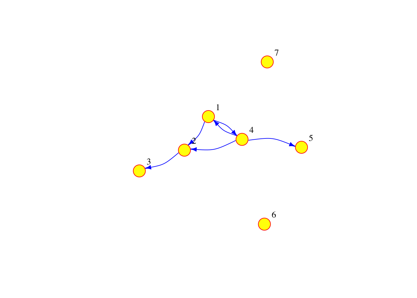
The network can also be defined as a list containing pairs of named nodes. Then, it is not necessary to specify the number of nodes but the isolated nodes have to be included. The following code generates a network which is equivalent to the one above.
g3 <- graph( c("City 1","City 2", "City 2","City 3", "City 1","City 4",  "City 4","City 1",  "City 4","City 2", "City 4","City 5"), isolates=c("City 6", "City 7") )
plot(g3, vertex.frame.color="red",  vertex.label.color="black",
vertex.label.cex=0.9, vertex.label.dist=2.3, edge.curved=0.3, edge.arrow.size=.5, edge.color = "blue", vertex.color="yellow", vertex.size=15) 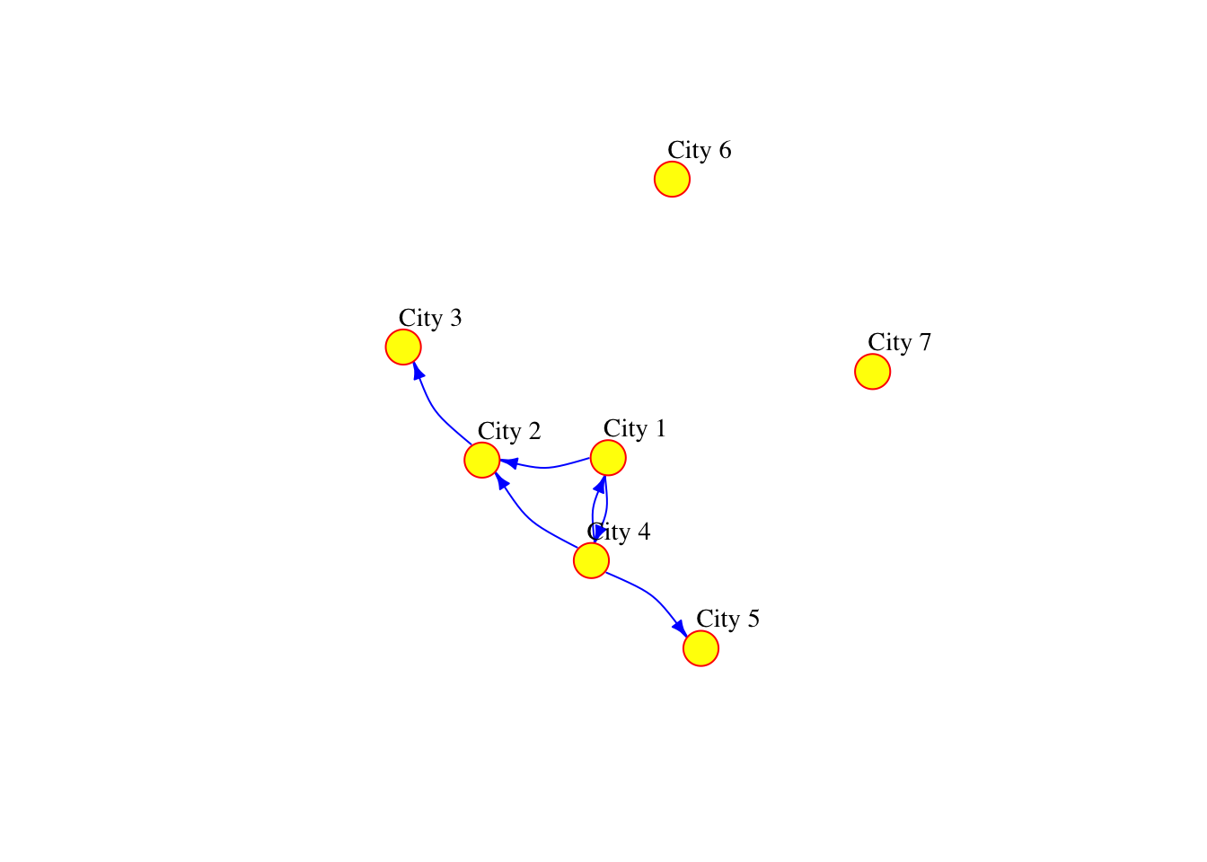
5.3.2 Adding attributes
In R, we can add attributes to the nodes, edges and the network. To add attributes to the nodes, we first need to access them via the following command:
V(g3)+ 7/7 vertices, named, from e5712f8:
[1] City 1 City 2 City 3 City 4 City 5 City 6 City 7The node attribute name is automatically generated from the node labels that we manually assigned before.
V(g3)$name[1] "City 1" "City 2" "City 3" "City 4" "City 5" "City 6" "City 7"But other node attributes could be added. For example, the current population of the cities represented by the nodes:
V(g3)$population <- c(134000, 92000, 549000, 1786000, 74000, 8000, 21000)Similarly, we can access the edges:
E(g3)+ 6/6 edges from e5712f8 (vertex names):
[1] City 1->City 2 City 2->City 3 City 1->City 4 City 4->City 1 City 4->City 2
[6] City 4->City 5and add edge attributes, such as the number of people moving from an origin to a destination city in two consecutive years. We call this attribute the weight of the edge, since if there is a lot of people going from one city to another, the connection between these cities has more importance or “weight” in the network.
E(g3)$weight <- c(2000, 3000, 5000, 1000, 1000, 4000)We can examine the adjacency matrix of the network, which represents the presence of edges between different pairs of nodes. In this case, each row corresponds to an origin city and each column to a destination:
g3[] #The adjacency matrix of network g37 x 7 sparse Matrix of class "dgCMatrix"
City 1 City 2 City 3 City 4 City 5 City 6 City 7
City 1 . 2000 . 5000 . . .
City 2 . . 3000 . . . .
City 3 . . . . . . .
City 4 1000 1000 . . 4000 . .
City 5 . . . . . . .
City 6 . . . . . . .
City 7 . . . . . . .We can also look at the existing node and edge attributes.
vertex_attr(g3) #Node attributes of g3. Use edge_attr() to access the edge attributes$name
[1] "City 1" "City 2" "City 3" "City 4" "City 5" "City 6" "City 7"
$population
[1] 134000 92000 549000 1786000 74000 8000 21000Finally, it is possible to add network attributes
g3$title <- "Network of migration between cities"5.4 Reading networks from data files
5.4.1 Preparing the data to create an igraph object
At the beginning of the chapter, we defined a data frame called df based on some imported data from movements between different UK local authority districts. This is a data frame containing 4,271 rows, but how can we turn this data frame into a network similar to the ones that we generated in Section 5.3. The igraph function graph_from_data_frame() can do this for us. To find out more about this function, we can run the following command:
help("graph_from_data_frame")As we can see, the input data for graph_from_data_frame() needs to be in a certain format which is different from our migration data frame. In particular, the function requires three arguments: 1) d, which is a data frame containing an edge list in the first two columns and any additional columns are considered as edge attributes; 2) vertices, which is either NULL or a data frame with vertex metadata (i.e. vertex attributes); and 3) directed, which is a boolean argument indicating whether the network is directed or not. Our next task is therefore to obtain 1) and 2) from the migration data frame called df.
Let us start with argument 1). Each row in df will correspond to an edge in the migration network since it contains information about a pair of origin and destination cities for two consecutive years. The names of the origin and destination LAs are given by the columns in df called origin_LAD and destiantion_LAD. In addition, the column called flow gives the number of people moving between the origin and the destination cities, so this will be the weight attribute of each edge in the migration network. Hence, we can define a data frame of edges which we will call df_edges that conforms with the format required by the argument 1) as follows:
#The pipe operator used below and denoted by %>% is a feature of the magrittr package, it takes the output of one function and passes it into another function as an argument

# Creates the df_edges data frame with data from df and renames the columns as "origin", "destination" and "weight"
df_edges <- data.frame(df$origin_LAD, df$destination_LAD, df$flow) %>%
  rename(origin = df.origin_LAD, destination = df.destination_LAD, weight = df.flow)
For argument 2) we can define a data frame of nodes which we will call df_nodes, where each row will correspond to a unique node or city. To obtain all the unique local authorities from df, we can firstly obtain a data frame of unique origin LAs, then a data frame of unique LAs, and finally, apply the full_join() function to these two data frames to obtain their union, which will be df_nodes. The name of the unique cities in df_nodes is in the column called label, the other columns can be seen as the nodes metadata.
df_unique_origins <- df_edges %>%
  distinct(origin) %>%
  rename(name = origin)

df_unique_destinations <- df_edges %>%
  distinct(destination) %>%
  rename(name = destination)

df_nodes <- full_join(df_unique_origins, df_unique_destinations, by = "name")
Finally, a directed migration network can be obtained with the following line of code. It should contain 373 nodes and 4,271 edges. You can test this yourself with the functions that you learnt in Section 5.3.
g <- graph_from_data_frame(d = df_edges,
                                       vertices = df_nodes,
                                       directed = TRUE)
If we try to plot the network g containing the migratory movements between UK Local Authorities with the plot() function as we did before, we obtain a result which is rather undesirable…
plot(g)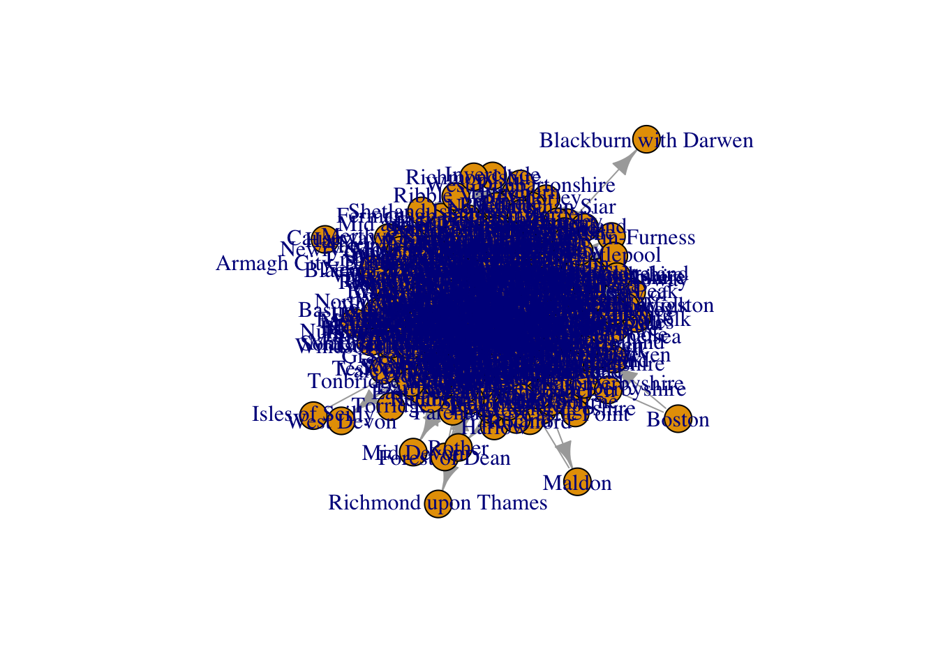
5.4.2 Filtering the data to create a subgraph
We will dedicate the entirety of next section to explore tools that can help us improve the visualisation of networks, since it is one of the most important aspects of network analysis. To facilitate the visualisation in the examples shown in Section 5.5, we will work with a subset of the full network g. A way to create a subnetwork is to filter the original data frame. In particular, we will filter df to only include cities from a particular region, in this case, the North West of England. To filter, we use the filter() function. In this case, we are filtering the dataset so that it only contains data corresponding to local authorities in Greater Manchester.
Manchester_LAs <- c('Bolton', 'Bury', 'Manchester', 'Oldham', 'Rochdale', 'Salford', 'Stockport', 'Tameside', 'Trafford', 'Wigan')Then, we can prepare the data as we did before to create g. But, instead of basing the network on df, we will generate it from df_sub.
# Create a new data frame containing the columns for the origin, destination, and weight from df_sub
# Rename the columns to origin, destination, and weight respectively
df_sub_edges <- df_edges %>% filter(origin %in% Manchester_LAs) %>% filter(destination %in% Manchester_LAs)

df_sub_unique_origins <- df_sub_edges %>%
  distinct(origin) %>%
  rename(name = origin)

df_sub_unique_destinations <- df_sub_edges %>%
  distinct(destination) %>%
  rename(name = destination)

df_sub_nodes <- full_join(df_sub_unique_origins, df_sub_unique_destinations, by = "name")

# Create a graph object from the edges and nodes data frames
g_sub <- graph_from_data_frame(d = df_sub_edges,
                                       vertices = df_sub_nodes,
                                       directed = TRUE)
5.5 Network visualisation
5.5.1 Visualisation with igraph
Let us start by generating the most basic visualisation of g_sub.
plot(g_sub)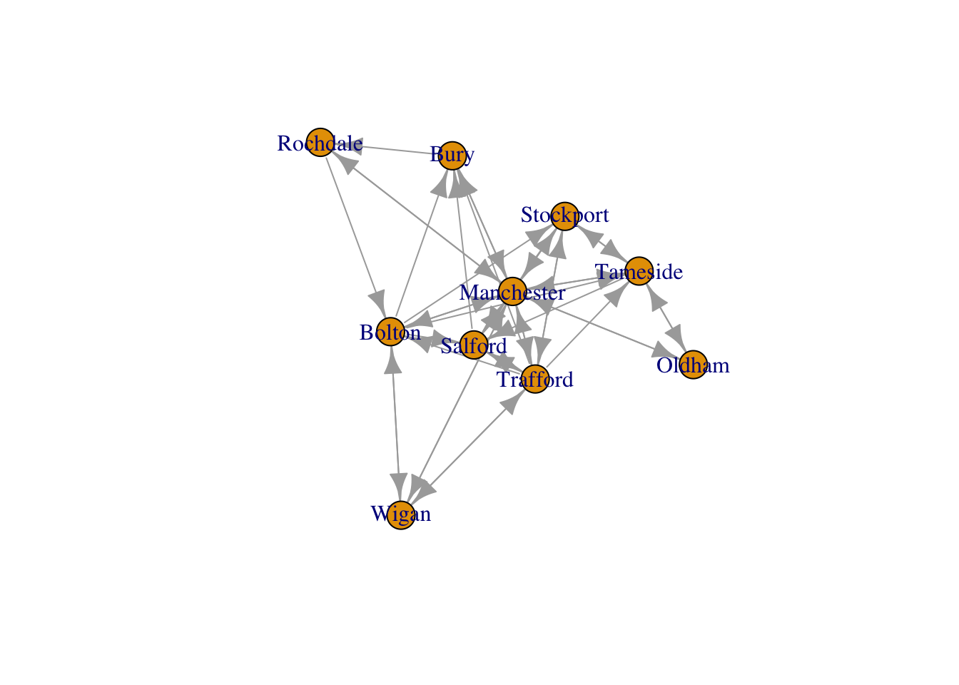
This plot can be improved by changing adding a few additional arguments to the plot() function. For example, by just changing the color and size of the labels, the color and size of the nodes and the arrow size of the edges, we can already see some improvements.
plot(g_sub, vertex.size=10, edge.arrow.size=.2, edge.curved=0.1,
vertex.color="gold", vertex.frame.color="black",
vertex.label=V(g_sub)$name, vertex.label.color="black",
vertex.label.cex=.65)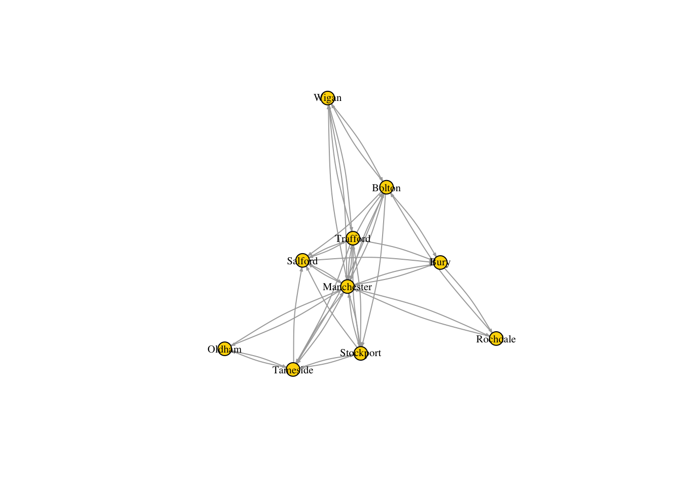
But there are few more things we can do not only to improve the look of the diagram, but also to include more information about the network. For example, we can set the size of the nodes so that it reflects the total number of people that the corresponding cities receive. We can do this by adding a new node attribute, inflow, which is obtained as the sum of the rows of the adjacency matrix of g_sub.
V(g_sub)$inflow <- rowSums(as.matrix(g_sub[]))Below we set the node size based on the inflow attribute. Note the formula \(2\times(V(g\_sub)\$inflow)^{0.5}\), where the power of 0.5 is chosen to scale the size of the nodes in such a way that the largest ones do not get excessively large and the smallest ones do not get excessively small. We also set the edge width based on its weight, which is the total number of people migrating from the origin and destination cities that it connects.
# Set node size based on inflow of migrants:
V(g_sub)$size <- 2*((V(g_sub)$inflow)^0.5)
# Set edge width based on weight:
E(g_sub)$width <- E(g_sub)$weight/6
Run the code below to discover how the aspect of the network has significantly improved with the modifications that we have introduced above.
plot(g_sub, vertex.size=V(g_sub)$size, edge.arrow.size=.1, edge.arrow.width=9, edge.curved=0.1, edge.width=E(g_sub)$width, edge.color ="gray80",
vertex.color="gold", vertex.frame.color="gray90",
vertex.label=V(g_sub)$name, vertex.label.color="black",
vertex.label.cex=.65)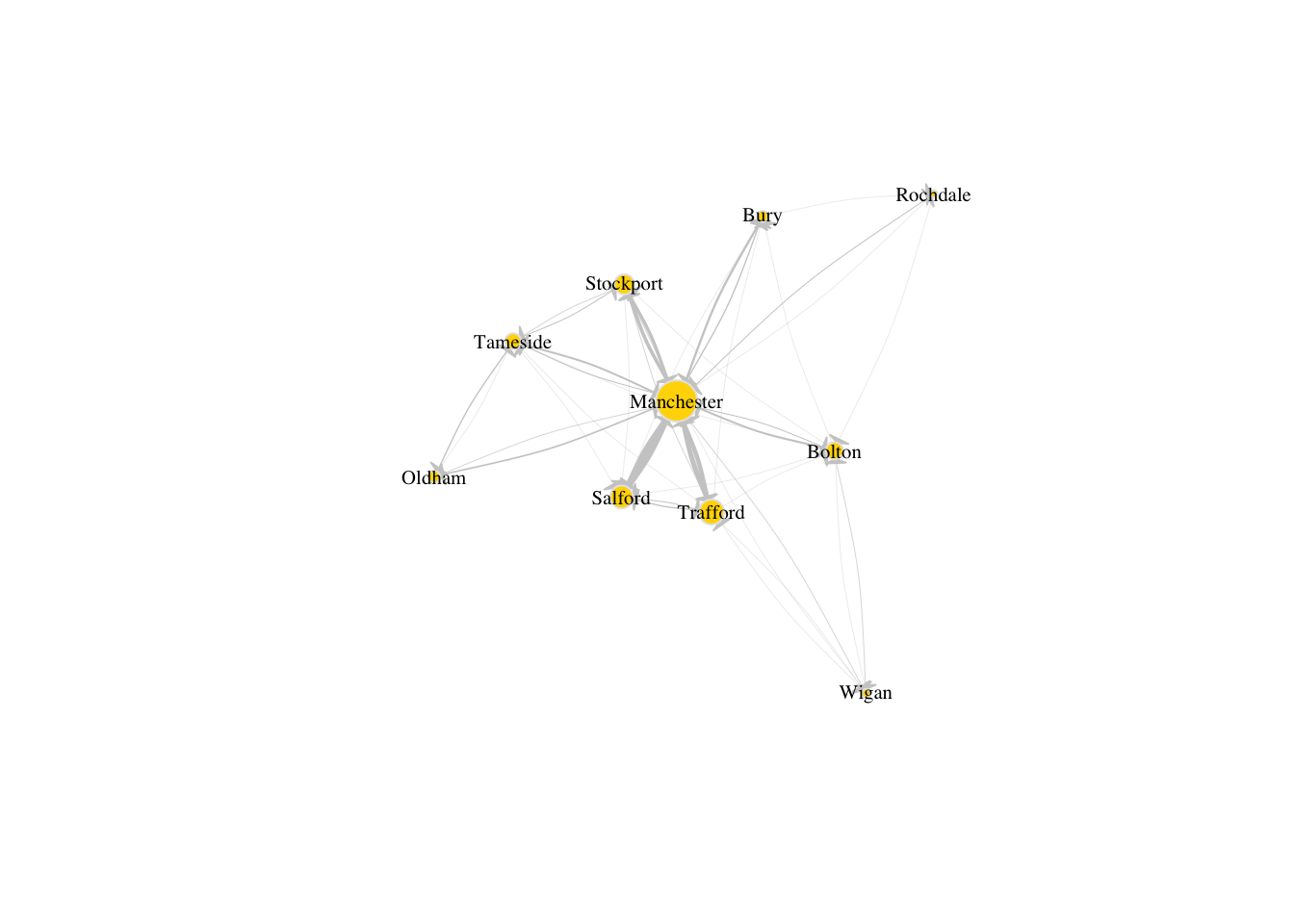
5.5.2 Visualisation of spatial networks
Firstly, we will import geographical data for the local authority districts in the whole of the UK, using the sf package. Here, we are only interested in the Local Authorities in Greater Manchester so we will filter the data frame LAs to keep only the metropolitan areas, i.e. those entries where the value in column LAD222NM is a local authority from Greater Manchester
# Import LA areas https://geoportal.statistics.gov.uk/
LAs <- st_read("./data/networks/Local_Authority_Districts_(December_2022)_Boundaries_UK_BFC/LAD_DEC_2022_UK_BFC.shp")
Reading layer `LAD_DEC_2022_UK_BFC' from data source
`/Users/franciscorowe/Library/CloudStorage/Dropbox/Francisco/uol/teaching/envs418/202526/r4ps/data/networks/Local_Authority_Districts_(December_2022)_Boundaries_UK_BFC/LAD_DEC_2022_UK_BFC.shp'
using driver `ESRI Shapefile'
Simple feature collection with 374 features and 10 fields
Geometry type: MULTIPOLYGON
Dimension: XY
Bounding box: xmin: -116.1928 ymin: 5336.966 xmax: 655653.8 ymax: 1220302
Projected CRS: OSGB36 / British National GridSince we are focusing on Greater Manchester, let us filter LAs so that it only includes data from Greater Manchester:
LAs_sub <- LAs %>% filter(LAD22NM %in% Manchester_LAs )We will now find the centroid of each LA polygon and add columns to LAs_sub for the longitude and latitude of each centroid.
# Add longitude and latitude corresponding to centroid of each LA polygon
LAs_sub$lon_centroid <- st_coordinates(st_centroid(LAs_sub$geometry))[,"X"]
LAs_sub$lat_centroid <- st_coordinates(st_centroid(LAs_sub$geometry))[,"Y"]
We can now plot the polygons for the LAs belonging to Greater Manchester as well as the centroids:
plot(st_geometry(LAs_sub))
plot(st_centroid(LAs_sub$geometry), add=TRUE, col="red", cex=0.5, pch=20)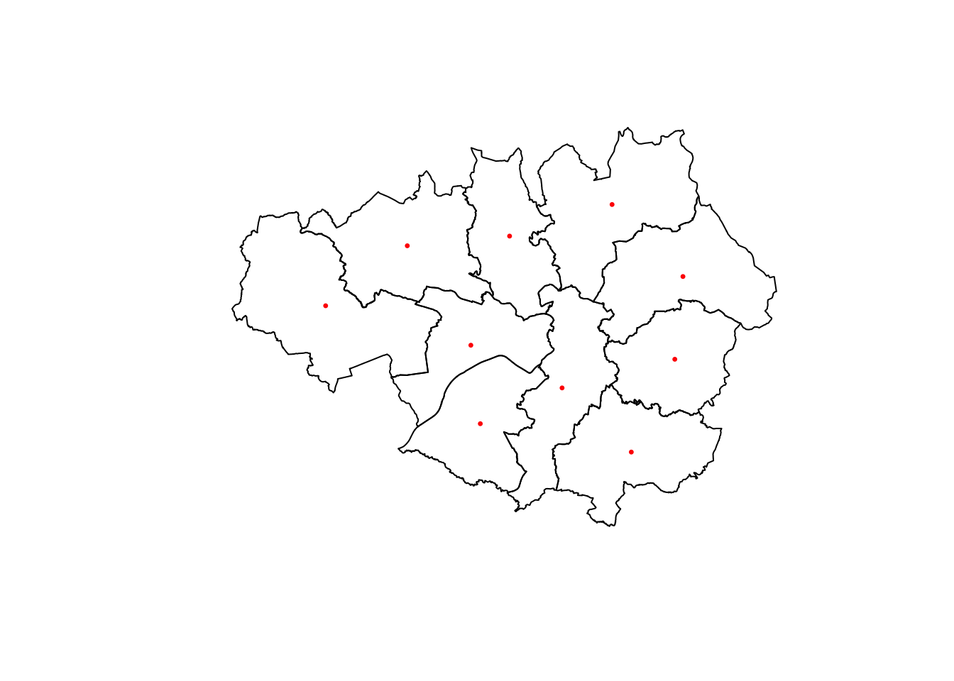
However, we still need to link this geographic data to the network data that we obtained before. In order to incorporate the geographic information to the nodes of the migration subnetwork, we can join data from two data frames: LAs_sub, which contains the geographic data, and df_sub_nodes, which contains the names of the nodes. To do this, we can use the function left_join() and then, select only the columns of interest. For more information on this magical function, check this link.
# Join the data frame of nodes df_sub_nodes with the geographic information of the centroid of each LA
df_sub_spatial_nodes <- df_sub_nodes %>% left_join(LAs_sub, by = c("name" = "LAD22NM")) %>% select(c("name", "lon_centroid", "lat_centroid"))
Now, instead of using igraph to plot the graph, we will be using ggraph. This interacts nicely with other packages to plot data and maps, such as ggplot2 and ggmap. Before we proceed with plotting the graph, let’s specify the coordinates of the nodes by defining a custom layout according to the information in df_sub_spatial_nodes.
custom_layout <- data.frame(
  name = df_sub_spatial_nodes$name,  # Node names from the graph
  x = df_sub_spatial_nodes$lon_centroid,    # Custom x-coordinates
  y = df_sub_spatial_nodes$lat_centroid     # Custom y-coordinates
)
We are now ready to plot:
# Plot the graph 'g_sub' with specific visual attributes
plot <- ggraph(as_tbl_graph(g_sub), custom_layout) + # basic graph plot with custom layout
  geom_edge_link(color = "gray80", alpha=0.9, aes(width = E(g_sub)$weight)) + # custom edges
  scale_edge_width(range = c(.5, 3)) + # scale edge size
  geom_node_point(aes(color = "gold", size = V(g_sub)$size)) + # custom nodes
  scale_size_continuous(range = c(1, 5)) + # scale node size
  geom_node_text(aes(label = name), size=2.5,  repel = TRUE) + # custom node labels
  scale_color_identity() + # scale node color (not relevant for this plot, but could be for others)
  theme(legend.position = "none", panel.background=element_rect(fill = NA, colour = NA)) + # map legend and background color
  geom_sf(data = LAs_sub, fill = NA, color = "black") + # basic map plot
  labs(title = " ") + # title for plot
  ggspatial::annotation_scale(location = 'tl') + # scale bar
  ggspatial::annotation_north_arrow(location = 'br') # north arrow

plot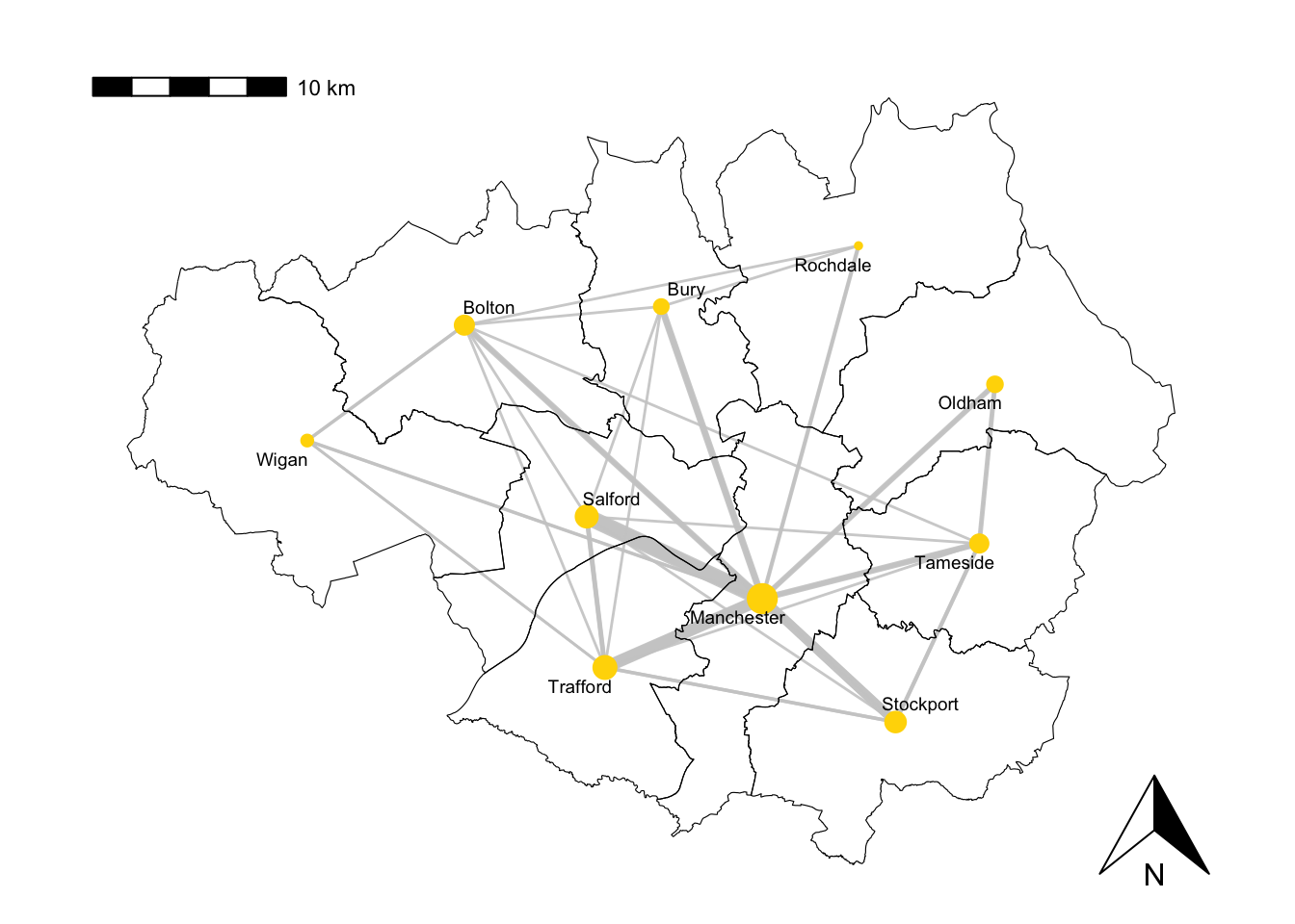
5.5.3 Alternative visualisations
In this session we have based our visualisations on igraph, however, there exist a variety of packages that would also allow us to generate nice plots of networks.
For example, migration networks are particularly well-suited to be represented as a chord diagram. If you want to explore this type of visualisation, you can find further information on the official R documentation and also, for example, on this other link link.
5.6 Network metrics
Here we define some of the most important metrics that help us quantify different characteristics of a network. We will use the migration network for the whole of the UK again, g. It has more nodes and edges than g_sub and consequently, its behaviour is richer and helps us illustrate better the concepts that we introduce in this section.
5.6.1 Density
The network density is defined as the proportion of existing edges out of all the possible edges. In a network with \(n\) nodes, the total number of possible edges is \(n\times(n-1)\), i.e. the number of edges if each node was connected to all the other nodes. A density equal to \(1\) corresponds to a situation where \(n\times(n-1)\) edges are present. A network with no edges at all would have density equal to \(0\). The line of code below tells us that the density of g is approximately 0.03, meaning that about 3% of all the possible edges are present, or in other words, that there are migratory movements between almost half of every pair of cities.
edge_density(g, loops=FALSE)[1] 0.030780655.6.2 Reciprocity
The reciprocity in a directed network is the proportion of reciprocated connections between nodes (i.e. number of pairs of nodes with edges in both directions) from all the existing edges.
reciprocity(g)[1] 0.2701943From this result, we conclude that about 27% of the pairs of nodes that are connected have edges in both directions.
5.6.3 Degree
The total degree of a node refers to the number of edges that emerge from or point at that node. The in-degree of a node in a directed network is the number of edges that point at it whereas the out-degree is the number of edges that emerge from it. The degree() functions, allows us to compute the degree of one or more nodes and allows us to specify if we are interested in the total degree, the in-degree or the out-degree.
# Compute degree of the nodes given by v belonging to graph g_US, in this case the in-degree
deg <- degree(g, v=V(g), mode="in")

# Produces histogram of the frequency of nodes with a certain in-degree
hist(deg, breaks = 50, main="Histogram of node in-degree")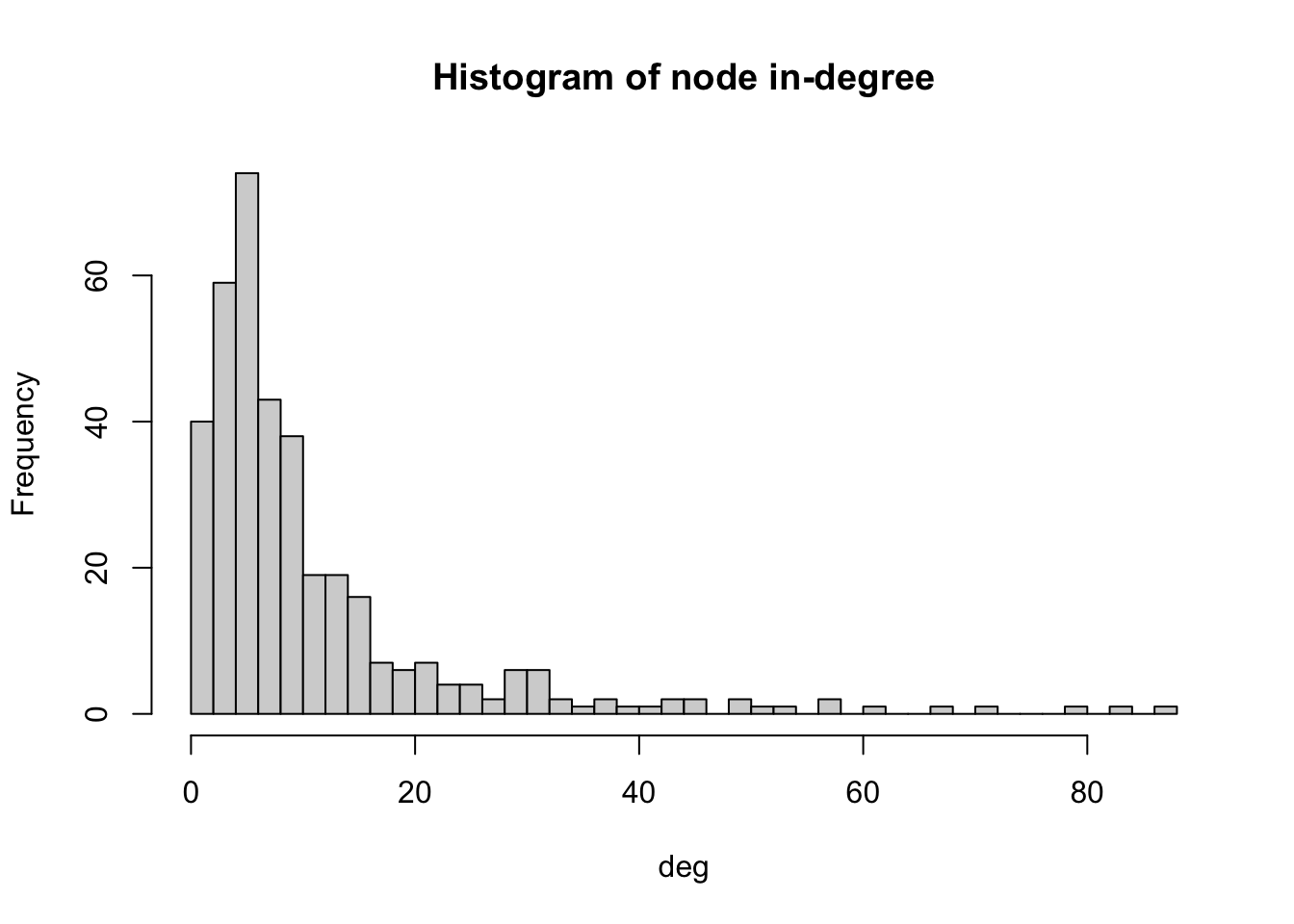
As we can see in the histogram, most LAs receive immigrants from 4-6 LAs. Very few LAs receive immigrants from 60 or more LAs. We can check which is the LA with the maximum in-degree.
V(g)$name[degree(g, mode="in")==max(degree(g, mode="in"))][1] "Liverpool"The LA with the highest in-degree is Liverpool. The in-degree is 87 as we can see below.
degree(g, v=c("Liverpool"), mode="in")Liverpool
87 Note that the fact that these two cities have the largest in-degree does not necessarily mean that they are the ones receiving the largest number of migrants.
5.6.4 Distances
A path in a network between node \(A\) and node \(B\) is a sequence of edges which joins a sequence of distinct nodes, starting at node \(A\) and terminating at node \(B\). In a directed path there is an added restriction: the edges must be all directed in the same direction.
The length of a path between nodes \(A\) and \(B\) is normally defined as the number of edges that form the path. The shortest path is the minimum number of edges that need to be traversed to travel from \(A\) to \(B\).
The length of a path can also be defined in other ways. For example, if the edges are weighted, it can be defined as the sum of the weights of the edges that form the path.
In R, we can use the function shortest_paths() to find the shortest path between a given pair of nodes and its length. For example, below we can see that the shortest path between Kensington and Chelsea and Liverpool is one, meaning that there are people migrating between these two locations.
shortest_paths(g,
from = V(g)$name=="Kensington and Chelsea",
to = V(g)$name=="Liverpool",
weights=NA, #If weights=NULL and the graph has a weight edge attribute, then the weigth attribute is used. If this is NA then no weights are used (even if the graph has a weight attribute)
output = "both") # outputs both path nodes and edges
$vpath
$vpath[[1]]
+ 2/373 vertices, named, from f175980:
[1] Kensington and Chelsea Liverpool
$epath
$epath[[1]]
+ 1/4271 edge from f175980 (vertex names):
[1] Kensington and Chelsea->Liverpool
$predecessors
NULL
$inbound_edges
NULLOf all shortest paths in a network, the length of the longest one is defined as the diameter of the network. In this case, the diameter is 6 meaning that the longest of all shortest paths in g has 6 edges.
diameter(g, directed=TRUE, weights=NA)[1] 6The mean distance is defined as the average length of all shortest paths in the network. The mean distance will always be smaller or equal than the diameter.
mean_distance(g, directed=TRUE, weights=NA)[1] 2.6713815.6.5 Centrality
Centrality metrics assign scores to nodes (and sometimes also edges) according to their position within a network. These metrics can be used to identify the most influential nodes.
We have already explored some concepts which can be regarded as centrality metrics, for example, the degree of a node or the weighted degree of a node, also known as the strength of a node, which is the sum of edge weights that link to adjacent nodes or, in other words, the in-flow or out-flow associated with each node. As we can see from the code below, many nodes in g have an in-flow of less than 100 immigrants. Note that we have set mode to c(“in”) for inflow and we have set the weights parameter to NULL since we want to know the sum of weights for the incoming edges and not just the total number of incoming edges.
# Compute strength of the nodes belonging to graph g, in this case the in-flow
strength_g <- strength(g, #The input graph
  vids = V(g), #    The vertices for which the strength will be calculated.
  mode = c("in"), #“in” for in-degree
  loops = FALSE, #whether the loop edges are also counted
  weights = NULL #If the graph has a weight edge attribute, then this is used by default when weights=NULL. If the graph does not have a weight edge attribute and this argument is NULL, then a warning is given and degree is called.
)

#Produce histogram of the frequency of nodes with a certain strength
hist(strength_g, breaks = 50, main="Histogram of node strength")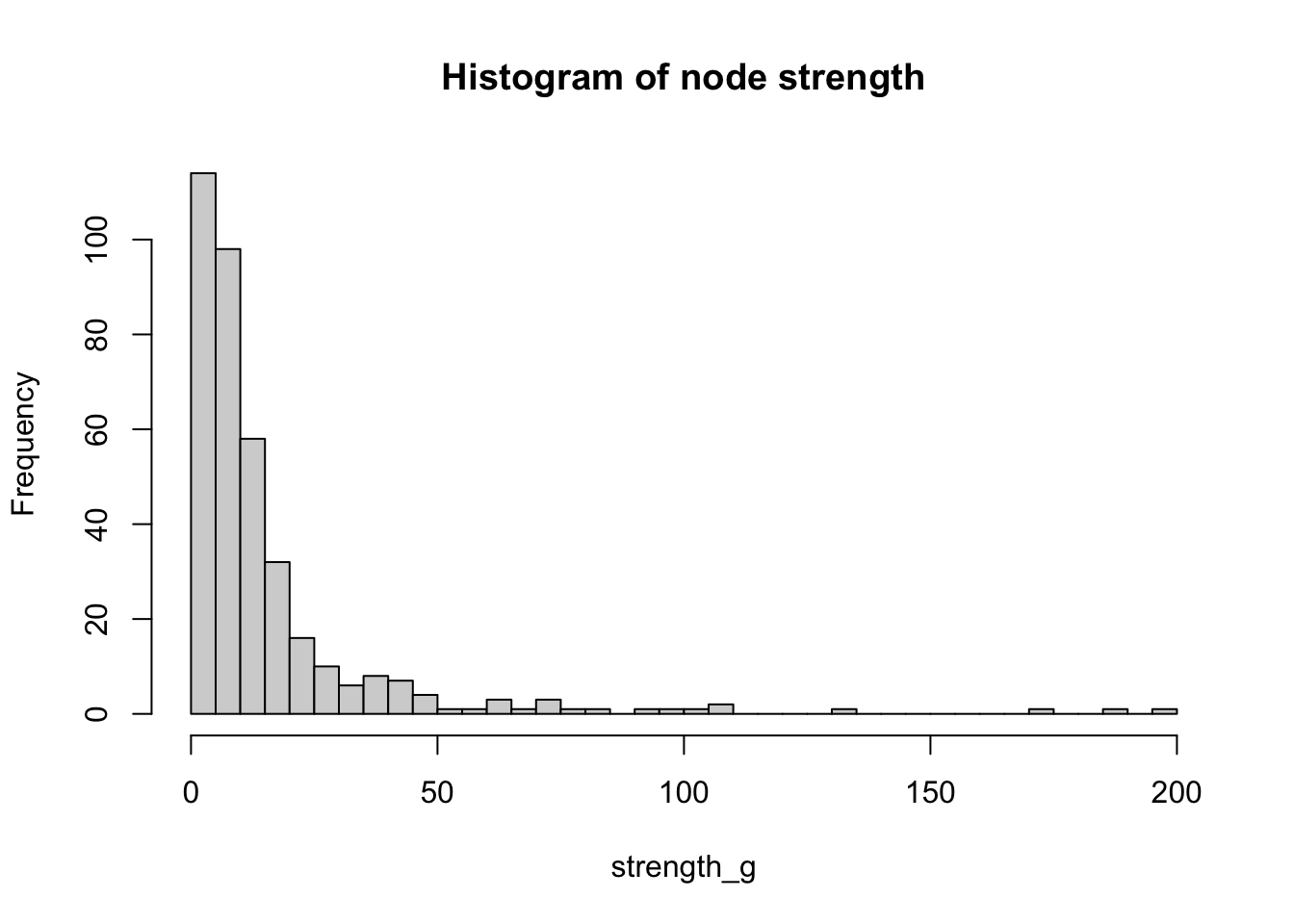
We can check which is the LA with the maximum strength:
V(g)$name[strength(g, vids = V(g), mode = c("in"), loops = FALSE, weights = NULL)==max(strength(g, vids = V(g), mode = c("in"), loops = FALSE, weights = NULL))][1] "Liverpool"We will look at another two important centrality metrics that are based on the structure of the network. Firstly, closeness centrality which is a measure of the length of the shortest path between a node and all the other nodes. For a given node, it is computed as the inverse of the average shortest paths between that node and every other node in the network. So, if a node has closeness centrality close to \(1\), it means that on average, it is very close to the other nodes in the network. A closeness centrality of exactly \(0\) corresponds to an isolated node.
close_centr <- closeness(g, mode="in", weights=NA) #using unweighted edges
hist(close_centr, breaks = 50, main="Histogram of closeness centrality")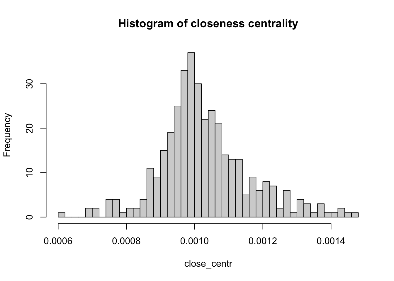
The other metric is known as betweenness centrality. For a given node, it is a measure of the number of shortest paths that go through that node. Therefore, nodes with high values of betweenness centrality are those that play a very important role in the connectivity of the network. Betweenness can also be computed for edges.
between_centr <- betweenness(g, v = V(g), directed = TRUE, weights = NA)
hist(between_centr, breaks = 50, main="Histogram of betweenness centrality")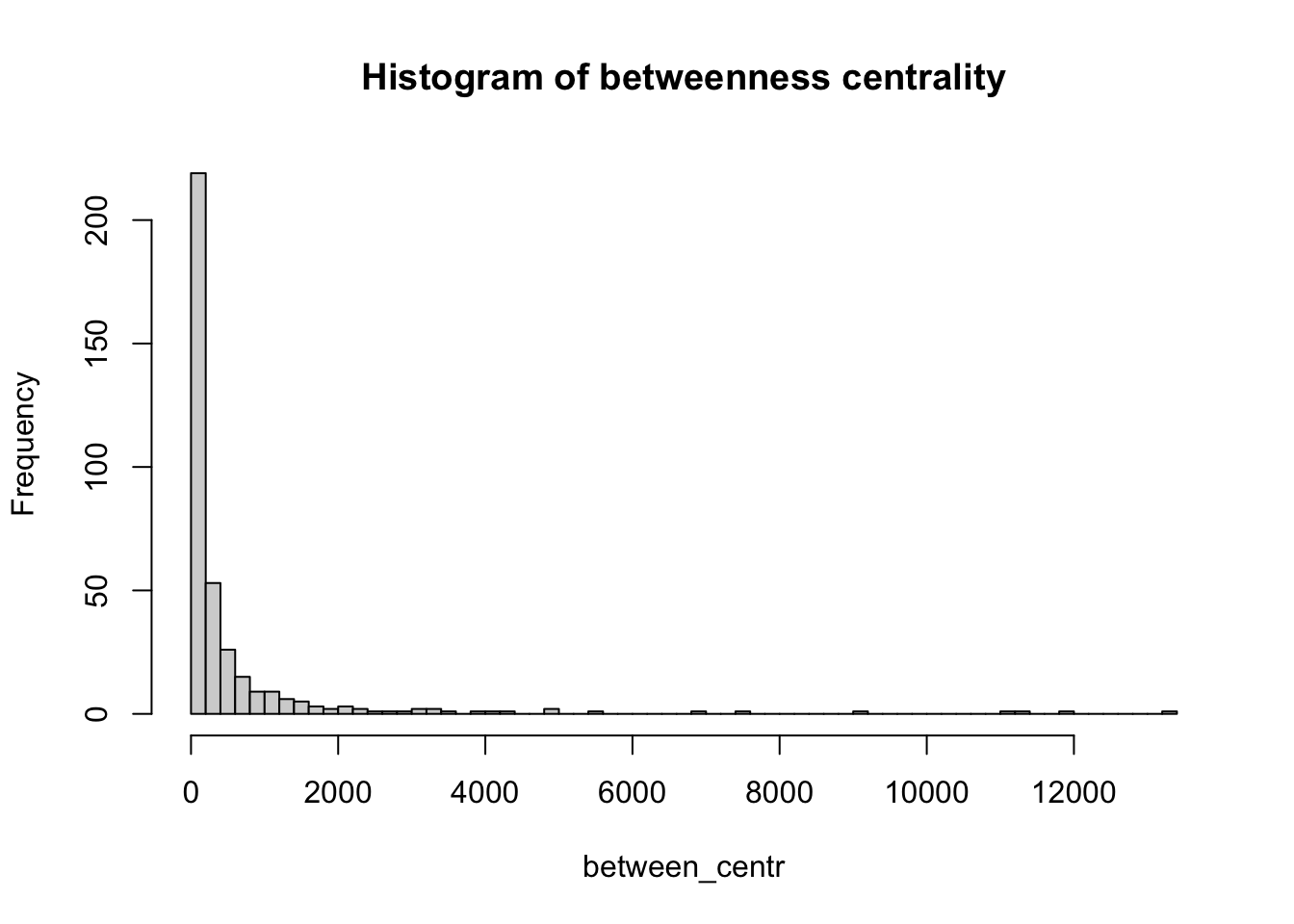
5.6.6 Hubs and authorities
We call hubs or authorities those nodes with a higher-than-average degree. Normally, the name hub is reserved to nodes with high out-degree whereas authority is reserved to nodes with high in-degree. An algorithm to detect hubs and authorities was developed by Jon Kleinberg, although it was initially used to examine web pages. Like we did for other network metrics, we can compute the hub score and then plot a histogram to see how this metric is distributed across the nodes of the network.
hs <- hub_score(g, weights=NULL)$vector #In this case, we use the weighted edgesWarning: `hub_score()` was deprecated in igraph 2.0.3.
ℹ Please use `hits_scores()` instead.hist(hs, breaks = 50, main="Histogram of hub score")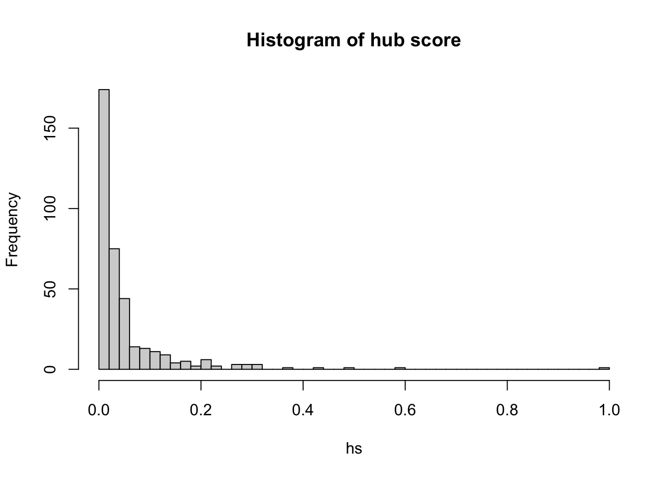
Similarly, we can explore the authority score for each node:
as <- authority_score(g, weights=NULL)$vectorWarning: `authority_score()` was deprecated in igraph 2.1.0.
ℹ Please use `hits_scores()` instead.hist(as, breaks = 50, main="Histogram of authority score")
5.7 Questions
In this set of questions, as well as analysing population movements between April 2019 and May 2019, we will also explore population movements between April 2020 and May 2020, in the middle of COVID-19
df_covid <- read.csv("./data/networks/internal_migration_uk.csv")
df_covid <- df_covid %>% filter(month_start=='2020-04')
With this dataset, generate a network called g_covid analogous to g, but for the April-May 2020 time period.
Knowing that the inner London local authorities are given by:
inner_LND_LAs <- c('Camden', 'City of London', 'Greenwich', 'Hackney', 'Hammersmith and Fulham', 'Islington', 'Kensington and Chelsea', 'Lambeth', 'Lewisham', 'Southwark', 'Tower Hamlets', 'Wandsworth', 'Westminster')provide answers to the following essay questions:
Create a graph visualisation of the population movements between inner London local authorities that displays the changes in the period April-May 2020 with respect to the period April-May 2019. You can be as creative as you want. For example, you might create a visualisation of a directed graph on top of a map of inner London, where the nodes are the centroids of the local authorities and the edges between LAs are coloured according to the extent to which the flow of people has increased or decreased from one year to the next. You may find a hint on how to do this for example here. Other ideas are welcome. You may need to do a few Internet searches in order to be able to complete this question, however, you should be able to achieve the fundamentals with the libraries loaded for this session (you can always use more if you want!). Your output will be graded for clarity, aesthetics and the correctness of the displayed data. Do not forget to add clear legends, scale bars and North arrows.
Furthermore, briefly comment on your findings. Do the patterns you observe agree with your intuition? You may suggest reasons for the observed patterns to arise.
Consider the movements between Camden and the rest of local authorities in the country. Using the strength of a node, compute the net flow of people moving between Camden and the rest of the country, both in April-May 2019 and 2020. Comment on the difference in net flow between these two years.